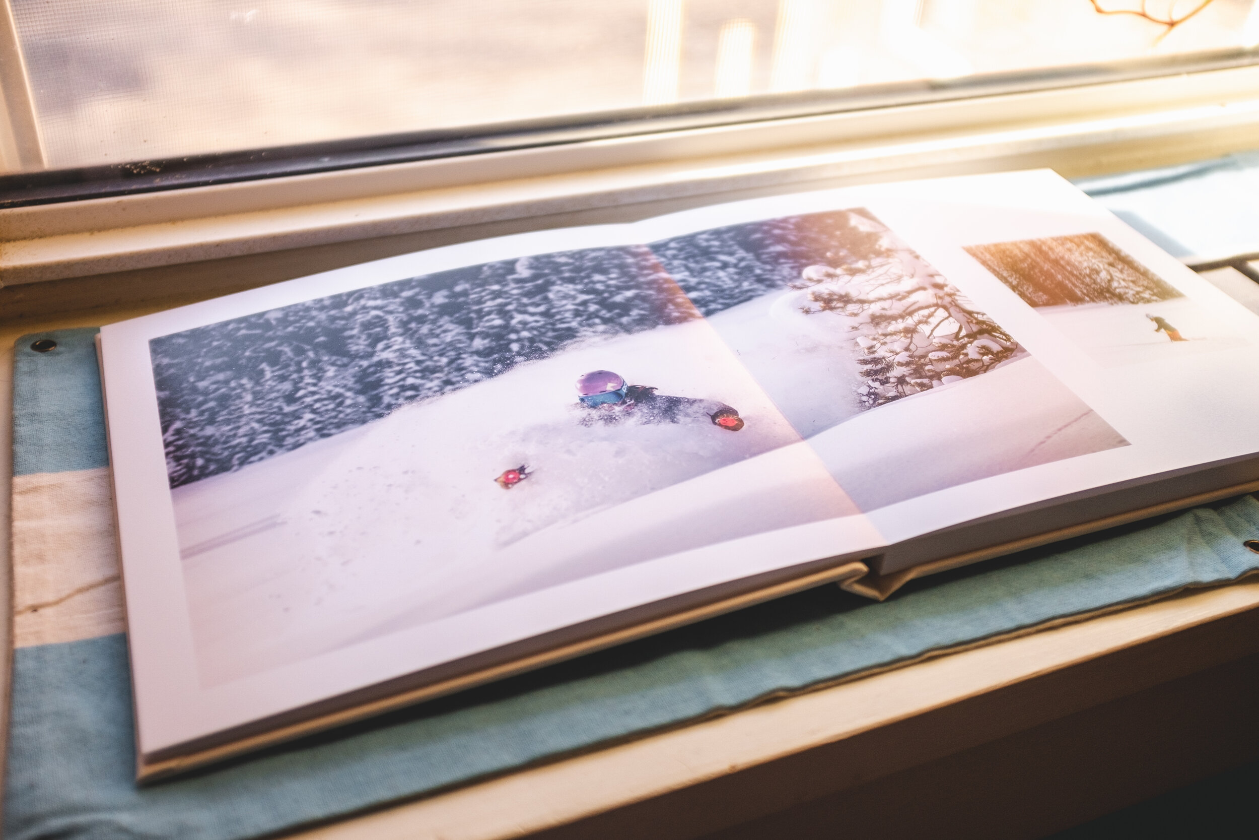
Last month was really busy with tests and school. As usual I was finding ways to use the creative side of my brain and as luck would have it I got an opportunity to make a book from a german company, Saal Digital! I have been working on a book depicting the time I spent in the Sawtooths last January for sometime and it finally got done.
This is my first photo book that I’ve made and I definitely learned a lot in the process. Being that I only had a month I am honestly impressed with what I made. But, there’s definitely plenty that I would change the next time around. All I can say is that I appreciate all the help from Saal Digital.
First and foremost this book looks absolutely beautiful and very profesional! This specific book is the 8 x 8 inch professional line photo book with matte photo paper option and the white linen wrap cover. I love the look and feel of this book and the layflat pages are quite nice. There is definitely no complaints on the look and craftsmanship of this book! I like the almost waxy feel of the canvas which makes me believe it might be gently cleaned if needed. Also, the paper is impressively heavey to the touch as well as resists fingerprints pretty well.
There are two things that I noticed however, and I’m not sure if it was my fault or that of the company. The first of which is in the darker areas of the two page spreads there is a slight blue line on the fold of the pages. Now it is very faint but I would say that it is noticeable in the right light. So I would try and make the fold areas on those spreads lighter if possible. The second, is with the rendering of stars in the images. In print there is very little to no definition of the stars which is frustrating when compared to the images on screen. This could totally be from the definition of the printer and possibly from the smaller size of the image, but I still feel like it should have done a better job.
I really loved working on this book and writing the excerpts that are all throughout. One of the things that I would change in the a future copy is using smaller sized font. For the most part it looks fine however I think it looks a bit corny with how large it is and with the paper’s matte finish. Finally, I definitely need to work on soft proofing and better understanding how to get the images printed to look the way they do on my screen. Soft proofing is a technique that involves color profiles and link/paper simulation in the attempt to make your pictures look better in print. I decided that the next time I make a book I am definitely going to get a proof made so that I can catch some of these issues before I get the final copy.
All in all I am very happy with the results and the help from Saal Digital to make it possible. I’ve also gotten some requests for a book and since this one set me back a pretty penny I’m going to start designing a soft cover version that will hopefully be more affordable.


