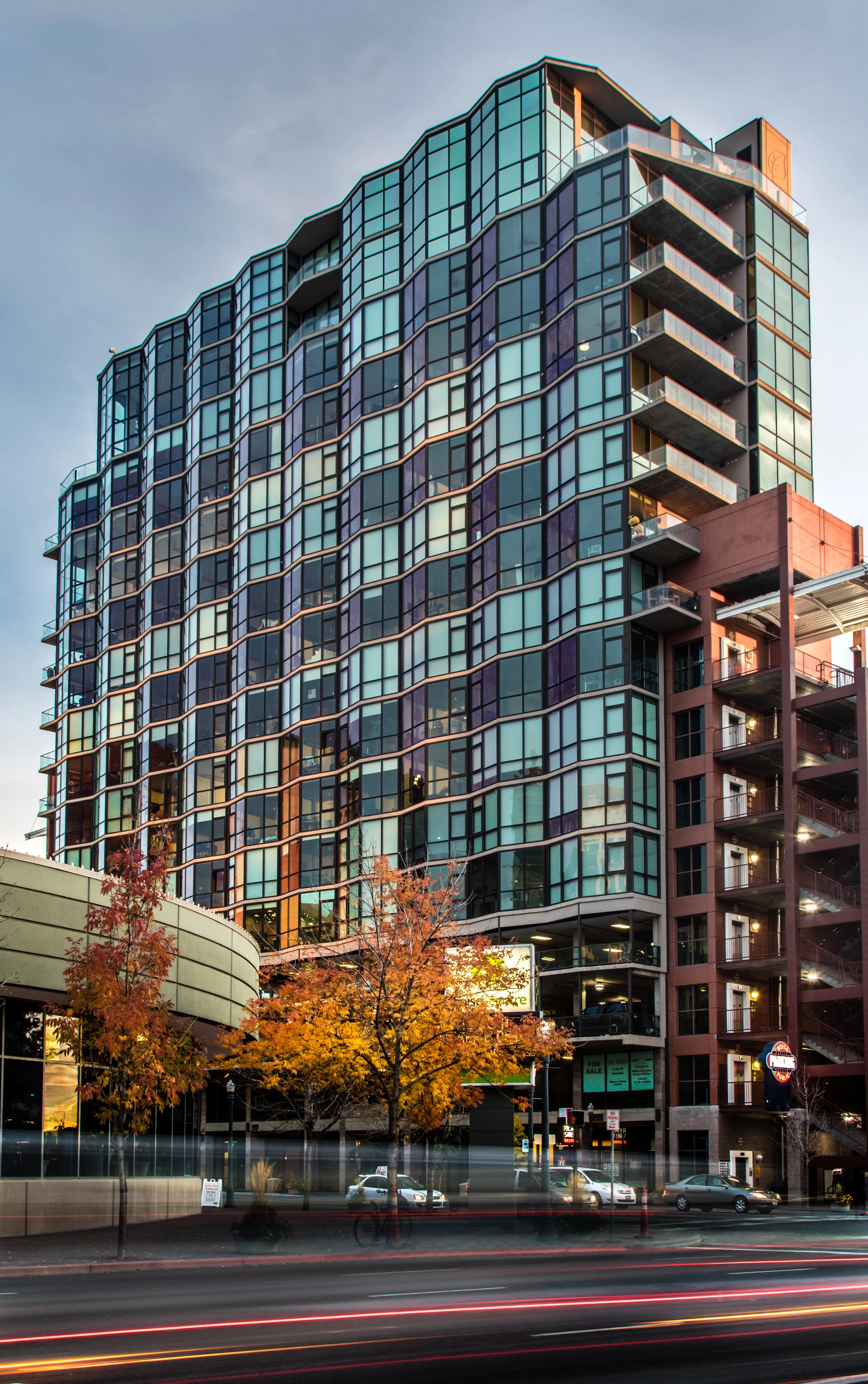
Good architectural photography is one of the most difficult genres as it requires an impressive eye and an expert knowledge of the photographic process. I’m not going to pretend that I know what I’m doing however, there are some impressive tools in Lightroom that can help set your images apart without any fancy equipment. To better understand why architectural photography is so difficult you need to learn about an inherent flaw in most camera designs. Most people don’t notice because it really does matter until you point your camera at a vertically prominent subject. The issue comes in the fact that DSLRs with a standard, non-tilt-shift, lens has a locked plane of view in relation to the sensor. This means when you point your camera up the image distorts with the lens, the wider the worse this effect is. It make the building appear as if it is falling back because the distortion exaggerates the distance away from the top of the building. To get around this issue there are specialty lenses and cameras which instead of tilting the camera up to get the frame you want the sensor stays parallel to the building and the lense physically shifts, moving the image up. While this is the best option to get rid of this problem, these cameras and lenses are really expensive.
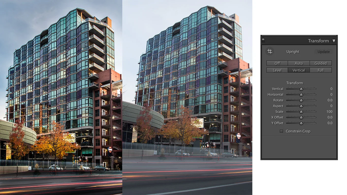
Lucky Lightroom has a good option to make this shift digitally by deleting and adding pixels. The image above is the Aspen Lofts building in downtown Boise wich is really hard to photography as it is leaning against a parking garage and has little prominence. Here even though I was shooting with a wide angle lense I had to tilt my camera up to get the top of the building in frame. As you can see from the middle unedited raw file this pushed the building back making it appear to fall back. To fix this you can take advantage of the transform box in Lightroom. If you are like me then you almost never use this tool as it never really does anything, however here it will save your image. For this picture I used the automatic vertical option which make sure the vertical lines are straight and level. This mimics using the technical movements that a normal lense prevents and solves the building from falling over in your image. While the automatic option worked well here it doesn’t always and most of the time you need to do it manually, if you need to this I would suggest to do a preliminary movement and then a day later fine tune it. I say this because it is really easy to over do it or make it look unnatural or just bad.
Hopefully this short post will help you make your architectural images look better. Even though this is a problem most easily noticed with building be aware that it also creeps into other things like landscapes and sometimes even portraiture.

